
ADOBE WELLBEING EXPO

ADOBE WELLBEING EXPO
Brand Design + Illustration + Event Signage
Program Lead/Strategist: Sara Torres
Adobe Wellbeing Expo is a site specific employee exposition created to highlight the employee offerings that are based on four pillars of the wellness program: Physical, Emotional, Community, and Financial. Adobe is always striving to create a workplace that offers its employees a wealth of options for support and growth. Adobe is also selected as one of Fortune’s 100 Best Companies To Work For. This program has garnered much acclaim and the Global Wellbeing Strategist for this program was featured in Forbes Magazine for the work she’s done at Adobe. We set out to make sure the new look hit all the marks.
GOAL:
TO CREATE A BRAND MARK & EVENT SIGNAGE FOR ADOBE WELLBEING EXPO THAT INCORPORATES THE ESSENCE PROGRAM PILLARS WITH ENERGETIC, FRESH BRAND GRAPHICS AND SIGNAGE.
SOME BACKGROUND
The first expo was in May 2016. The event was created in response to celebrate Global Employee Health & Fitness Month.Historically, the event was funded and executed by EXOS, Adobe’s corporate fitness providers. The original goal of the expos were to bring wellness related discounts & vendors onsite and provide fun wellness activities for employees. The events take place in Seattle, San Francisco, San Jose, and Lehi. The locations where Adobe has wellness centers.
The budget moved from external partnership EXOS to Adobe Global Workplace Experience and increased to highlight internal wellbeing programs vs external vendors. A stronger theme with a fresh look and feel that stands apart from the previous years, and will serve as a consistent new internal brand. Producing team are to leverage Events Team expertise & skill to make the event bigger and better.
RESEARCH & CONCEPTUALIZATION
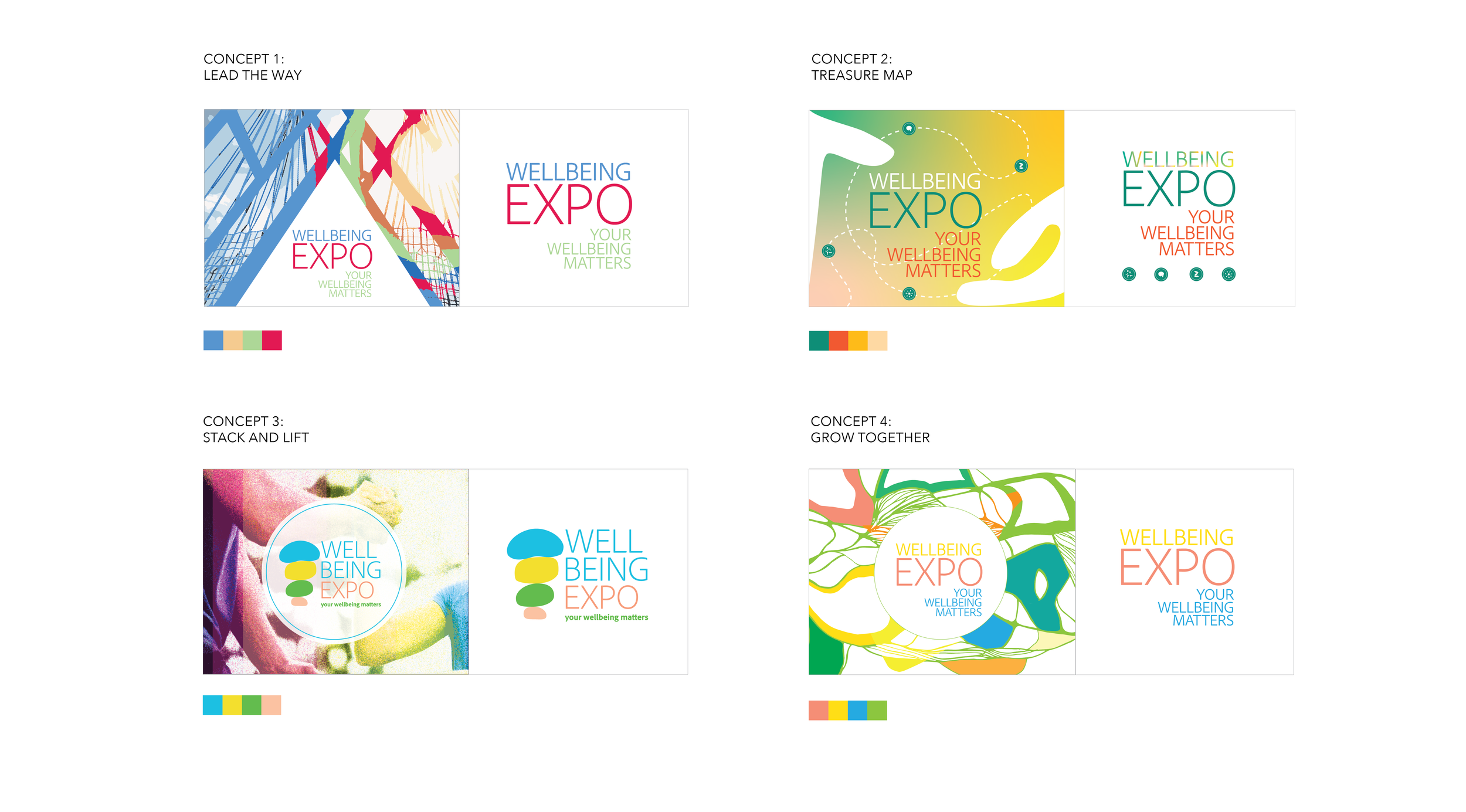
I used the four pillars: Physical, Emotional, Community, and Financial as a springboard for my initial sketches. While incorporating group activity imagery in the concept I used variations of the popsicle color palette from the discovery imagery. The presented concepts were:
1. LEAD THE WAY: This plays with the idea of leadership and team building exercises, trekking, and bridges.
2. TREASURE MAP: A playful journey weaving around with iconography that represents each pillar and framed with kind, supportive hands.
3. STACK AND LIFT: Zen rocks meet active team vibes. Symbolic of the pillars and a support system.
4. GROW TOGETHER: An abstract illustration inspired by body and mind, weaved about with vines and leaves conveying growth.
INITIAL COMPS
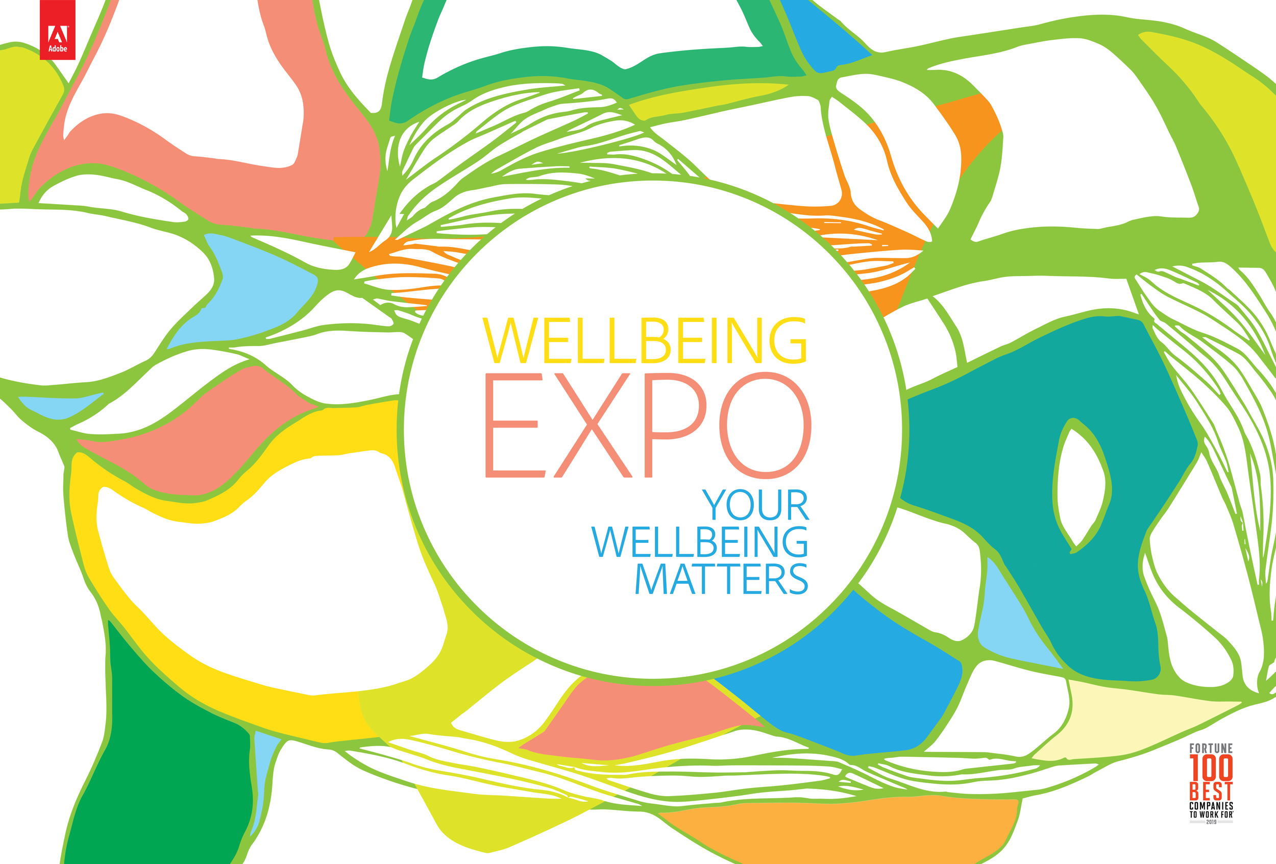
GROWING TOGETHER
Although all the concepts were received well, there was one clear favorite: Grow Together. The concept conveyed the event feeling and program pillars in a way that was abstract while having a fun, warm, inviting look and feel. The feeling of group wellness mixed with the vibrant expression was the right combination. The concept name also rang nicely in the ears of the team, making considerations on how they can use that in their event programming. The visuals were used for event signage, all employee marketing channels, and for event collateral. The event produced an increase in employee activation with event participation increase of 20% over the previous year.
WORDMARK + ILLUSTRATION SIGNAGE
“Take care of your body. It’s the only place you have to live. ”


